Free no-code no registration web app for combining scatterplots with barplots
A very usefull tool for combining scatter plots with barplots or violin plots is a free web app called ScatterPlot.Bar
It can also combine jitter with bar plots or columns and display statistical significance values or p-values together with brackets over the columns or bar plots. ScatterPlot.Bar can also overlay jitter over cross bars. Here they explain why this is preferential over bar plots. The picture below and their blog post explain this.
The user can also place the statistical significance values (or stars) on the plot. Manipulate the colors of the graphical elements along with width of the graphics.
In the second tab of the app one can upload the .csv file and start making groupped bar-, box- and violin-plots. The resulting plots can be downloaded as PDF, PNG or TIFF
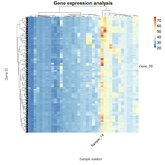
It also works as statistical calculator and has a capability to draw heatmaps like the one below:

